
The Bouba-kiki effect on branding: how sound symbolism shapes design
What would you say if someone told you a word sounded cutting, harsh or spiky to them? What would you think if they told you another word looked round, smooth or blobby? Sound symbolism is a phenomenon explored through what’s known as the Bouba-kiki effect. It’s our tendency to connect modalities together, e.g. sound and shape (or taste or emotion, etc). We explore this concept further and what it means for branding and design.

Understanding the bouba-kiki effect and sound symbolism
—
It all starts with a seemingly simple question, which of these two shapes is called “bouba” and which one is “kiki”?
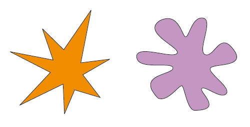
Inspired by a psychological study from 1929, researchers tested the manner in which we ascribe certain sounds to certain shapes. The following 2001 investigation invited participants to name two contrasting shapes out of a given selection of nonwords; “bouba” and “kiki”. These names contrasted sounds according to pronunciation and the visual shapes of each letter. Results found that 95% of participants assigned the word “bouba” to the rounder shape and “kiki” to the spikier shape, which is as the researchers predicted.
The study showcased the strength of the connections our brain makes between sounds and visual shapes. There have been many subsequent developments in this line of research, involving other senses like taste and how we perceive others’ appearances.
Before we look at how you could apply the bouba-kiki effect to branded designs, let’s look into understanding the theory.
Classifying sounds
When we talk about “rounded” sounds, we’re thinking about the shape our lips make when pronouncing these sounds. So the oo in “boot”, u in “fun” and o in “wrote” all require our lips to make a rounded shape to pronounce these words, while the vocalisation is happening at the back of our oral cavities. “Unrounded” sounds are therefore the opposite of this, they require the lips to be spread apart when pronounciated, like the ee in “peek”, i in “fit” or a in “had”.
Classifying shapes
The bouba-kiki effect shows the influence that the sound’s visual shape has on our perception of it. Consonants such as k, t or z are thought to be spikier, sharp sounds due to the shape of their corresponding letter. This is in contrast to letters like g, b or o, which are all considered as round, soft or curvy shapes and sounds. This means that a person’s literacy—or ability to interpret these letters—plays a big role in the bouba-kiki effect.
The language(s) spoken by each person also makes a difference, as does the letters in each corresponding alphabet. Sound symbolism is even implicated with how languages were formed, based on our innate assumptions and expectations. For the purpose of this blog post, we’re sticking to English.
Making crossmodal connections
So the premise of the bouba-kiki effect is that people tend to associate certain sounds with certain shapes and certain characteristics; this is called sound symbolism. The study found that for entities named with round sounding-words, people attribute easygoingness. For entities whose nouns involved spikier or sharper sounds, we tend to regard these as being more precise or determined.
These associations are called crossmodal connections, because they’re links we’re making across our senses. These links influences the choices we make and the biases we hold; they can even impact human relationships.
One explanation of this sound symbolism is the intrinsic human need to find patterns between things. Researchers claim this could be why we find sounds and shapes symbolic of humanistic personality traits.
Think about the recent phenomenon of the “Karen” meme. Is it a coincidence that the name chosen to denote such a person, to focus in on specific negative beliefs and behaviours that this type of person performs, is represented through a word made up of sharp, spiky and determined sounds and shapes? If we tilt our attention back to Bouba-kiki, this supports the theory in that sound symbolism and crossmodal connections influence the choices we make and the biases we hold.
Symbolic design and branding choices
—
Now that we’ve understood how our brains tend to associate sounds with shapes, let’s think about how this influences branding and design.
Let’s continue to think about the practical and more tangible outcomes.
If many humans have this inbuilt mechanism to attribute certain sounds to have certain shapes and characteristics, how could brands and designers use these findings to their advantage?
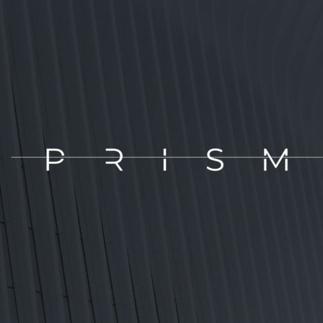
Your brand name is your very first introduction to a customer and it will evoke a response: a certain set of assumptions. And it’s not just sharp versus soft and big versus small.
Our associations with words go far beyond that, even to predicting humor.

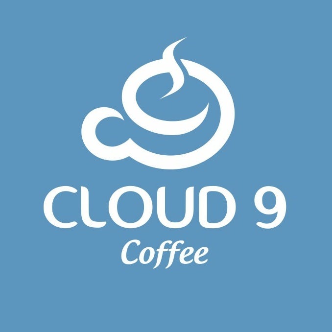
If we look at some famous examples, what is more “bouba” than Google? Easy, accessible experience that is so big that it almost literally holds the world and beyond. It was also a nonsensical word just like bouba at its culmination, leaving people to make assumptions about what it will be. while all the round spaces in the Google logo is very much a bouba.
And what about Nike? Precise, determined, energetic, competitive, you’ve got it all right there. The precision and action evoking Nike swoosh is more compatible with a kiki.
Piecing together a branding puzzle
Brands should be holistic and consistent in creating an aesthetic to attract their target audience. This means that every aspect of it needs to slot together.
If a brand or product name doesn’t complement the wider brand personality, it feels jolty and awkward. For instance, if the name is adopting a pre-existing word, its meaning might not match this new context; if it’s a nonword, it could sound unattractive, inappropriate or be hard to remember for target audiences. If this is the case, you won’t win customer trust.
A strong sense of branding needs to flow across every detail the brand subsumes. Its name needs to match the font it’s written in, the logo it’s joining onto and the company’s overall tone of voice.
This way of discerning what works together and what doesn’t comes down to individual tastes and preferences. At the core of this is the bouba-kiki effect and its—on the surface—seemingly simplistic finding that it’s in our nature to associate certain shapes and sounds together.
So the use of bouba-kiki in branding and design have to go hand in hand. All the elements that go into your brand identity work together to tell a cohesive story with an emotional, positive impact on target audiences. Here are some branding ideas and design tips based on the bouba-kiki effect.
Sounding out a name
—
As we’ve talked about, a brand name is at the core of any brand’s identity; it often remains a consistent foundation as the brand evolves over time.
A recent study explored the power of sound symbolism and applied it theoretically to branding. Researchers found that participants expected front vowels to feature in nouns denoting small entities and back vowels to be included in nouns denoting large entities. Whether a vowel is determined as front or back depends on the position of your tongue as you pronounce each sound.
The highest point of your tongue is poised towards the front of your mouth for front vowels. These include sounds like the a in “bad”, e in “shed and i in “knit”. The opposite is true when pronouncing back vowels. These sounds include the u in “huge”, o in “drone” and oo in “book”.
If we use a literal example for a minute, in Dickens’ Great Expectations the i in “Pip” conveys the quality of being “small”. This is rather fitting as Pip is the name of the protagonist in the book: a small child. On the other hand, the rounded o sound in “London”, evokes a sense of largeness.
Returning to the study, researchers found that using these vowels to convey such principles in nonwords is more effective and memorable than mixing nonwords with preexisting words. This means that if you’re a new brand or launching a new product, it’s going to be a really good idea to invent a word with sounds and letters that communicate the principles of your brand/product.
Upon hearing or reading the name, customers will then already have some sort of sense or expectation about your brand/product. Ultimately, this initiates space for consistent branding. It offers the beginnings of a seamless journey as potential customers become familiar with your brand.
Shaping a logo
—
Your logo design is just as elemental as your brand name; together they set the tone for your entire brand identity. So it’s easy to see how being mindful of sound symbolism can positively influence designs.
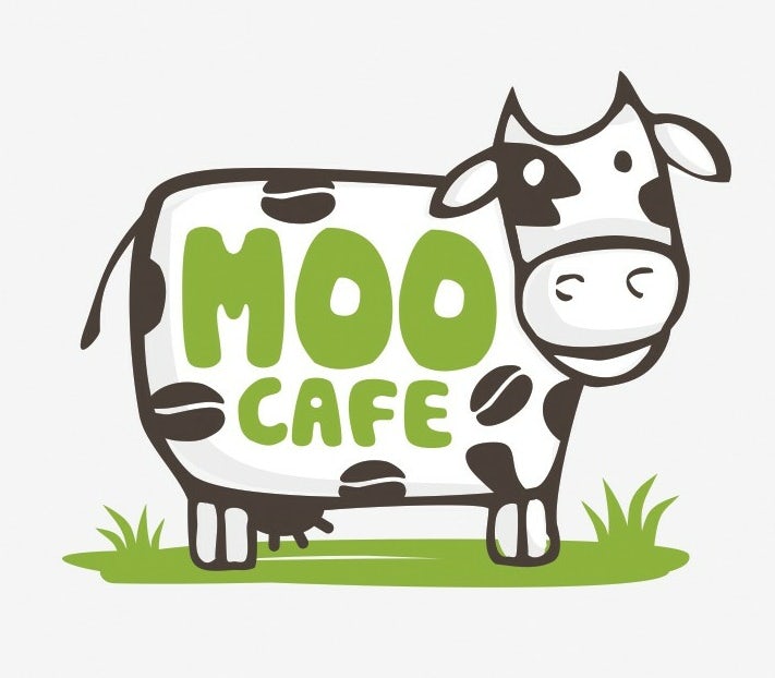
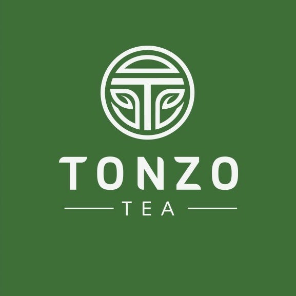
Employing curvy lines, round silhouettes and avoiding straight, sharp edges is going to be more “bouba”. As we can see from Moo Cafe’s logo design, pictured, these curves suit personable, natural brands offering a friendly experience for customers.
The opposite type of shape including harsh edges and straight lines feels more “kiki”. This could be a good starting point in logo design for brands wanting to affirm their efficiency, speed, or direct nature, such as banks or automobile companies.
There’s no reason why your brand name and logo can’t be even more obscure, somewhere in the middle of the two spectrums of bouba and kiki. You can make your own nonsensical word and shape based on your blossoming knowledge of sound symbolism.
This awareness of crossmodal associations can be an immensely helpful guide in how to convey your brand to an audience, on your own terms.
Spreading your wings with a visual presence
—
Once you have your brand name and logo perfected, you can begin to flesh out your wider visual presence. Is your brand largely digital or are you designing physical products or spaces? Are we talking branded web designs, product packaging or a holistic package both on and offline?
The cross-modal links you made use of in with your brand name and logo can extend throughout your entire brand aesthetic. And everything you create has to be consistent in style, sound and message.
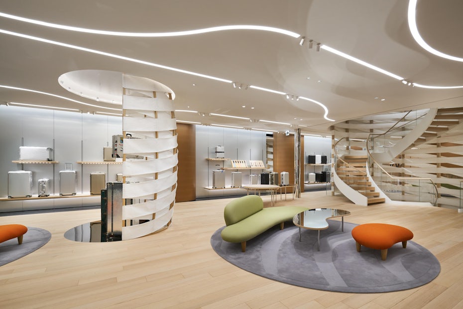
When working with a retail space, for instance, the sound of your name can be a great guide for how to shape that experience. Take a look at suitcase brand Rimowa’s (which sounds to me like a sleek bouba) flagship store in Tokyo: curvy, big and bright. The space is very compatible with the sound of the brand.
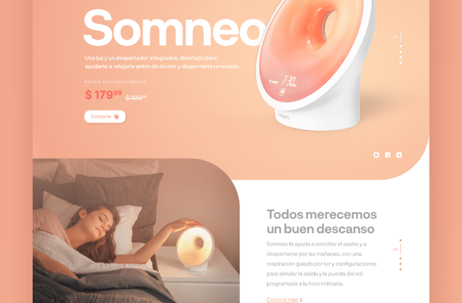
Perhaps it’s a singular, key product your brand focuses upon and you need a stunning web design to attract attention with. As you can see in the above example, Phillips have centred this site around one product. It oozes round, soft and smooth shapes across everything from it’s title “somneo”, to its sans serif font and the curve-edged layout design.
The brand echoes the shape of the product through the sound of its name and the warm pastels of its identity. It’s a great example of how to use sound symbolism to create a consistent visual presence for your brand.
Ride the bouba-kiki wave
—
Once you have an understanding of how sounds inform how we think things will look and feel, then you can really master it in your favor. It’s needless to say that psychology and branding go hand in hand.
There’s no explicit reason why you couldn’t support a round-sounding brand name with a spiky-looking logo, but it won’t feel as natural. Perhaps, your desired effect is an unnerving, awkward brand identity—just make sure that your audience are in on it.
Want to sharpen up and smooth our your brand identity?
Our talented designers will take care of it.
The post The Bouba-kiki effect on branding: how sound symbolism shapes design appeared first on 99designs.